
I created this poster alongside a new aesthetics for the School of Media internal communication.
Indeed, I wanted all the student recruitment posters to follow the same clean design.
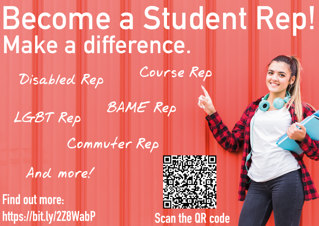
I used a linear font for the title which contrasts with the handwriting of the details to convey both the ideas that the Level Up Mentor Scheme is something serious but also fun.
I used a photograph as the background so students could relate more than if it was a drawing. I made sure the picture had bright dynamic colours to create a nice contrast with the white font.