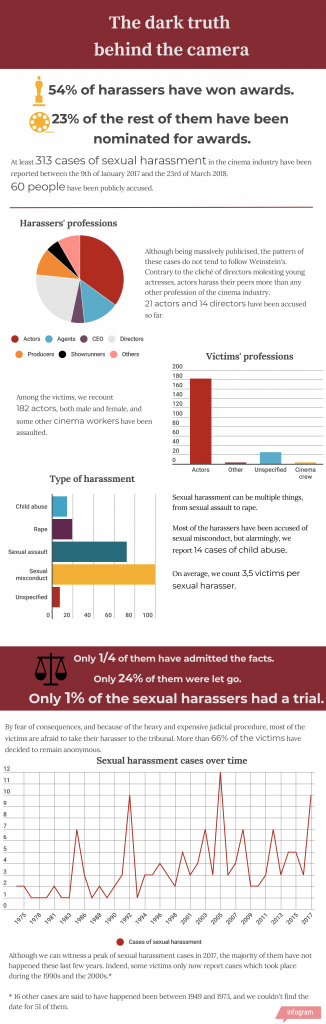
This is infographics about sexual harassment in Hollywood following the #MeToo movement. I created it for a wider investigation in partnership with Izabella Zimirowicz about the whole issue.
To achieve this result, I compiled data from multiple articles in an excel document over the course of several months, and finally produced the visualisation afterwards.
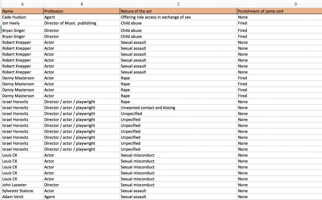
Original Twitter post: https://bit.ly/2YAwbs2
I decided what shapes would be the best for each piece of information as well as the ones which would be more understandable as a written percentage.
I used icons to complement it, to keep a sleek infographic look that focus more on the data than on the aesthetics itself.